|
Knitting stranded colorwork is one of my favorite things. It uses both hands so it's interesting enough that it keeps my attention. But it also has a rhythm that keeps it from being too hard. In the last few years, all the colorwork sweaters I've done have been from charts I developed myself, and often using my own handspun yarn. How did I get to that point? Or, more importantly, how could you get to the point where you're designing your own colorwork patterns? Start with Someone Else's Patterns to Get the Hang of ItWe all have to start somewhere, and working from other people's stranded colorwork patterns is the perfect place to start. If yoked sweaters are your jam, notice how the increases & decreases are placed in the colorwork pattern. Often, this will be done in the "background" color to minimize distortion of the pattern. Keep that idea in your back pocket as you go forward in your design journey! The KnitOvation Stitch Dictionary (reviewed in my last post) has some great resources if you want to plug different stitch patterns into an existing design. Combine Multiple Patterns to Create Unique CombinationsUsing one or more stitch dictionaries, combine multiple patterns. Think diamonds that shift in scale, or different kinds of flowers...essentially, pick a theme for your sweater, find a bunch of patterns that fit the theme, then arrange them in a way that makes you happy. Experiment with charting all of them together so you'll get a sense of how they look next to each other. This might lead to: Learn How to Resize, Center, and Move MotifsYou may need to modify the sizes of some patterns, or to move the starting point of a chart. Sometimes this means centering a motif on the front, back, or sides of the body, or it means avoiding awkward placement of motifs. Reverse Engineer Other Stranded Colorwork DesignsFind a colorwork pattern you like, but don't have a chart for. See if you can chart it out! Remember, at this point, you're still learning, so you shouldn't be trying to pass the design off as your own. Find Inspiration for Your Own PatternsInspiration is all around, and once you've gotten the hang of stranded colorwork, you'll wonder how you can turn your favorite images, symbols, and shapes into colorwork patterns! If you're struggling with this phase, I highly recommend Felicity Ford's Stranded Colorwork Sourcebook and Janine Bajus' The Joy of Color. Chart Your Own Patterns with Dots on Graph PaperKnit stitches aren't square - they're rectangular. The ratios of the rectangles depend on your gauge. If this bothers you at the charting stage, you can buy knitter's graph paper. Usually, though, I just use regular graph paper and a simple trick - dots. A dot in the middle of each square for my pattern color is quick, and it approximates the visual effect of a knit stitch. This did take some getting used to, since I started my knitting journey thinking that a dot always represented a purl stitch in a knitting chart! I demonstrate this around the 4:22 mark in the video. Remember to Consider Your Float Length!Ah, floats. There's a lot to say about floats. How long should they be? How long is too long? I'll admit, I let some of my floats get pretty long when the pattern absolutely demands it. And I don't trap floats, since this usually shows on the front side. But as a rule of thumb, a float shouldn't be longer than an inch, or an inch and a half if you're feeling really daring. Remember to consider this when you're creating your designs - usually this translates to no more than 5 to 7 stitches one color in a row. Consider Value Contrast When Selecting YarnsA strong value contrast (dark and light) will help your patterns read well. Take a picture with your phone, then converting it to black and white - if the two yarns look like they're the same shade of gray, you don't have much value contrast. Low contrast can create subtle effects, but it will be harder to see while you're knitting, and the pattern will be less clear when you're done. High contrast patterns are easier to see. Don't Forget to Swatch!Swatching can help you refine your design. Often, I find that I'm overflowing with ideas, and I've designed two or even three sweaters worth of stitch patterns. Swatching helps me simplify & problem solve so that there's less ripping out once I'm actually working on my project!
Do you have a tried-and-true stitch pattern design formula? I'd love to hear about it! Last month, I started designing myself a new stranded colorwork sweater. (More on that soon!) This usually means a flip through my stitch dictionaries. And since Andrea Rangel just published the KnitOvation Stitch Dictionary, I thought this was a great chance to review it.
KnitOvation picks up where Rangel's first book, AlterKnit, left off. Both books are a very high quality, and I see them as excellent companions to each other. While KnitOvation has only 150 stitch patterns to AlterKnit's 200, but it makes up for this with a brighter, more cheerful color palette, plus an excellent section that walks the knitter through how their yarn might affect the stitch definition of a stranded colorwork pattern. To my delight, there's no right or wrong answer here. Want to do stranded colorwork with 2-ply? 3-ply? Mohair? Speckles? Tonal yarn? A specific sheep breed? Chances are, there's a swatch already in KnitOvation. Of course, your mileage may vary, but this is a great way to shortcut the swatching process. The designs, too, are fun and funky. They range from "modern geometric" to graphics like crabs and dinosaurs. If stranded colorwork is interesting to you, I'd highly recommend both books. 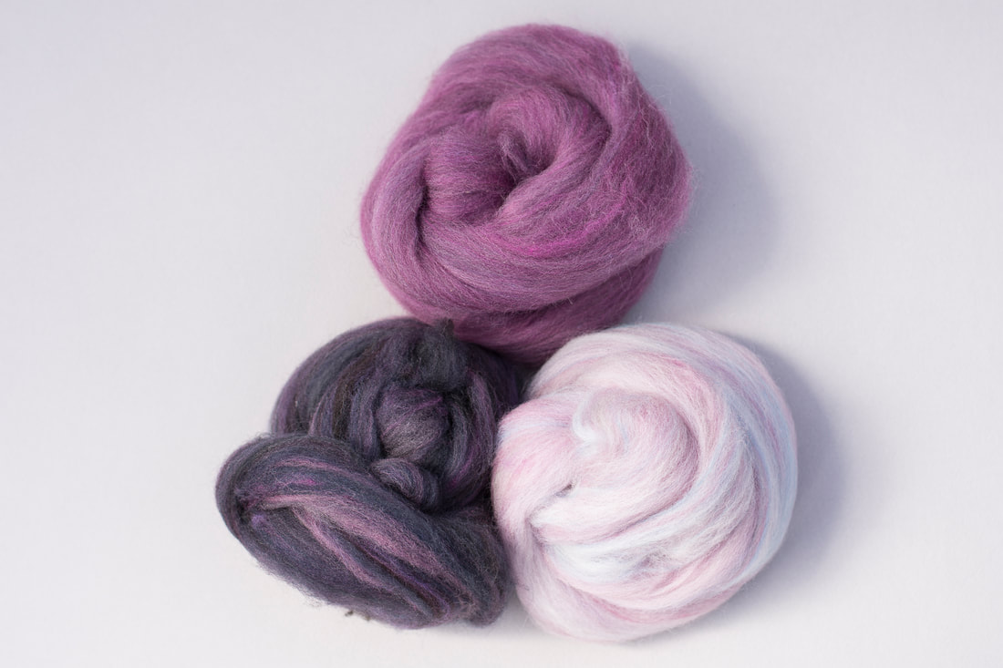 Lately, I've been working on a project that makes use of a gradient. This is to be a sweater quantity with most of the yarn in the darkest color. I started with several piles of color - most of it the mauve/magenta color shown at the top of the first photo. Then I blended it into a gradient, adding darker and and darker values on one end, until I got to the almost-black-purple, and lighter and lighter values on the other end, until I got to the pale lilac-pink. 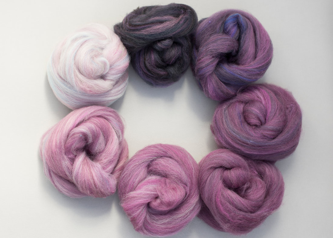 When I took the photo above, I realized there were a couple of places where I wanted to to smooth out the gradient, specifically at the lightest and darkest ends of the spectrum. So there are a couple more values in the gradient now! The fiber is mostly organic Polwarth, with a little bit of Merino and CVM in there too. I used the diz in the Spinner's Ultimate Multitool to pull the roving off the drum carder. Now I'm using the WPI gauge to make sure I spin to about 28 wraps per inch. I'm doing this as a short forward draw, which is a little bit outside my comfort zone, so I make sure to check pretty frequently! 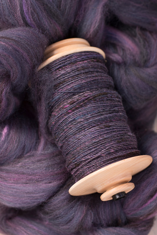 I'm starting with the darkest color. There's about 20 ounces of this, and then between 2-4 ounces of each of the other colors, so there should be plenty for the sweater I have in mind!
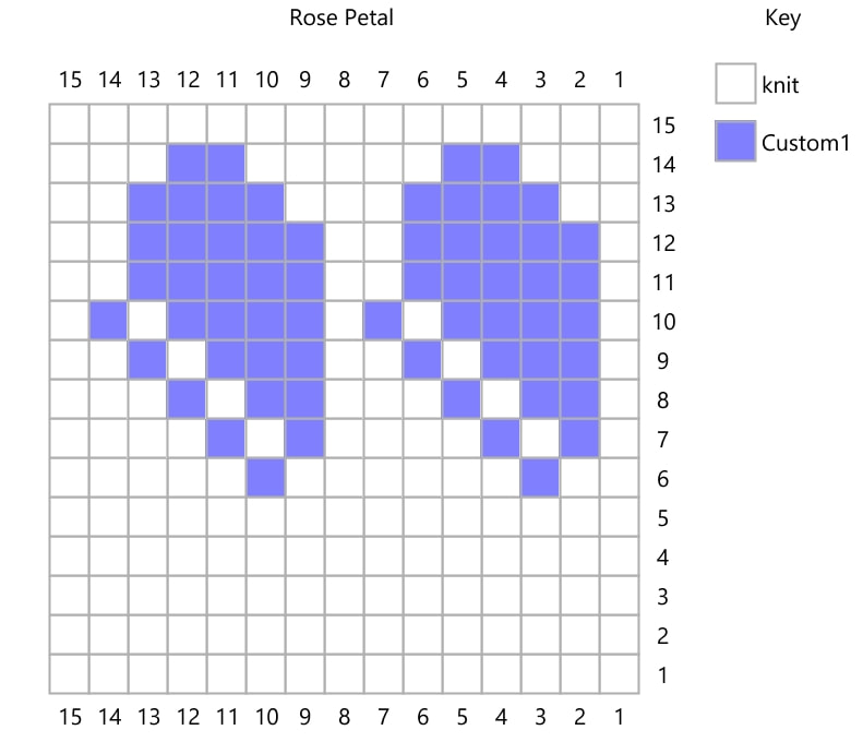
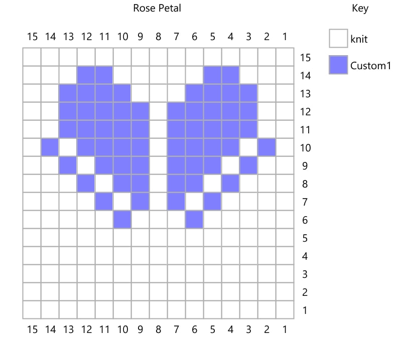
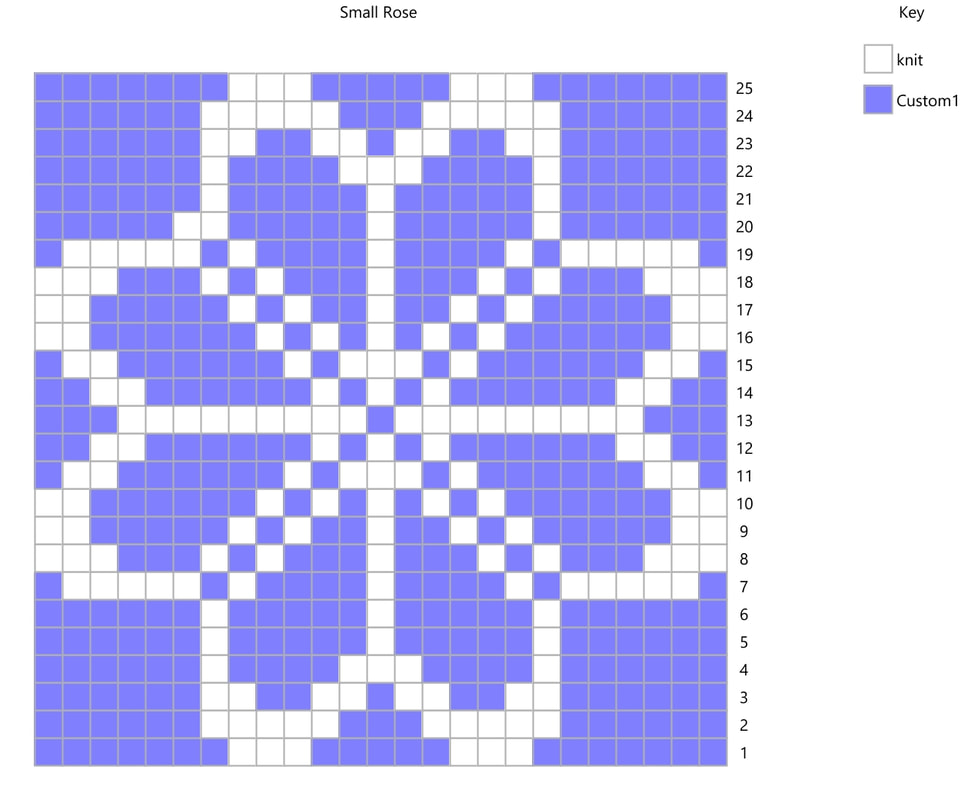
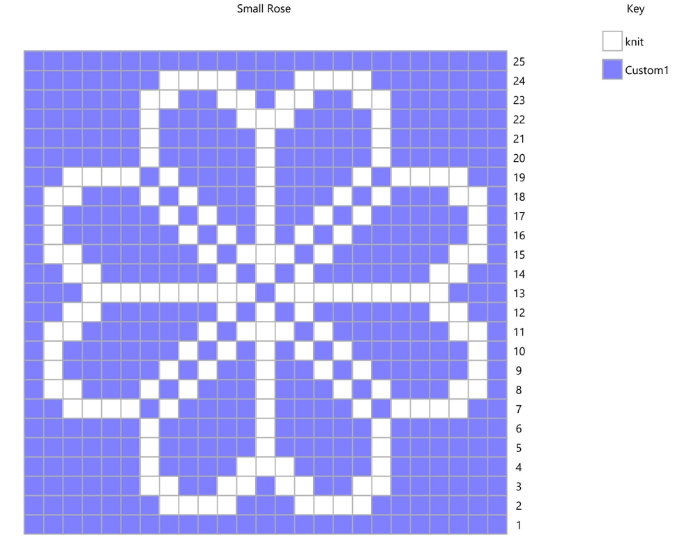
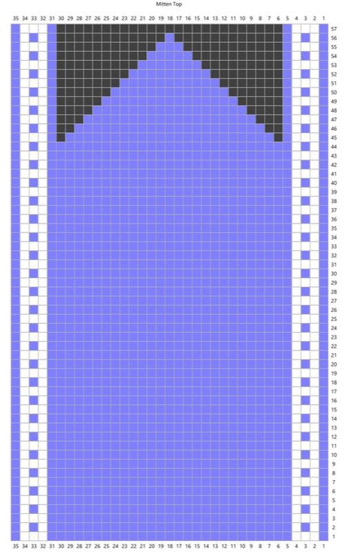 In my last post, I shared how to modify the size of a stranded colorwork motif. In this post, I'll share how to use it in a repeat with a simple mitten design. In this pattern, the dark gray/black square represent no stitch. There are decreases in the pattern to form the mitten top which are not noted in the chart - this is to give clarity in the colors. The set of five stitches at the left and right edges of the pattern form a border at the sides of the hand. They do not change, but as the decreases shape the top of the hand, they will slope inward. 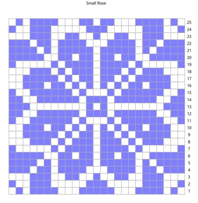 The first step in setting up a pattern repeat is to simply repeat the pattern. Here, I'm using a variation on the pattern I shared in my last post. 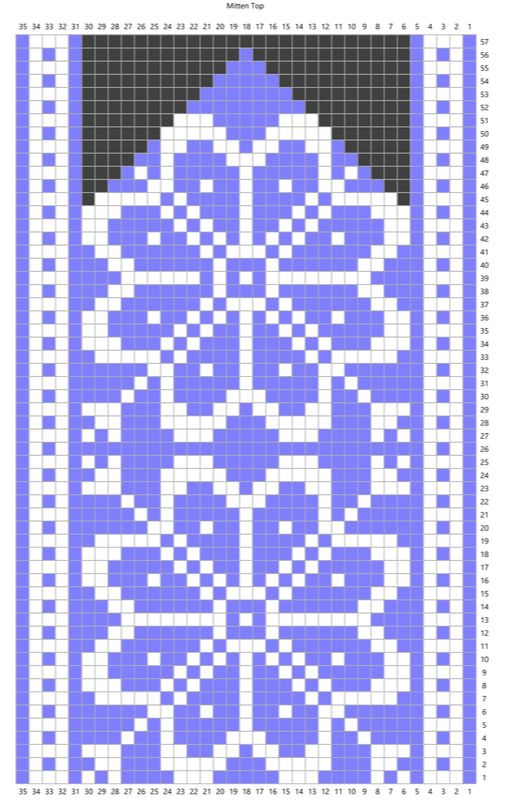 Stacking the pattern on top of itself, we get two repeats of the rose. The outer corners at the top of the rose are cut off. This is fine, as long as the rose itself fits fully into the pattern. (If it didn't we'd need to go back and adjust.) It seems like the white of the rose petals falls off the edge of the pattern. However, because the borders are edged in the background color, there will be a purple border around them.  Usually, when you repeat a large motif, there are places that end up with very long floats. The next step is to create new, smaller motifs to prevent these floats. Here, I've added a small cross and two dots between the motifs to prevent long floats. At the top, there is a lozenge shape to fill in the space. Your options at this step are limited only by the number of stitches you have and your imagination. And that's really all there is to it!  Have you ever fallen in love with a stitch pattern, but it's not quite the right size? In this post, I shared how to resize a cable pattern. Today, I'll share one approach to modifying the size and design of a stranded colorwork pattern. This is a great technique to use if you're using handspun yarn that doesn't exactly match the gauge of a pattern, or if you need to substitute yarn. In this example, I'm sizing down, but it would be just as easy to make the stitch pattern larger with these same ideas. 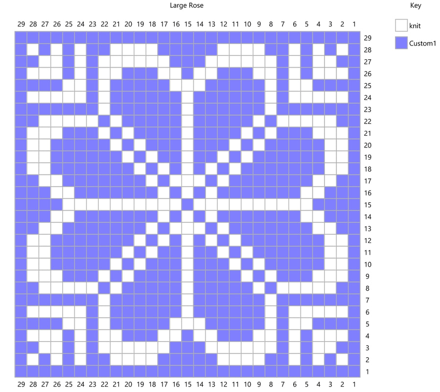 In this example, I started with a 29-stitch-square repeat of a traditional Norwegian 8-petal rose. I liked this pattern, but needed a stitch pattern that would fit into a 25-stitch square. The easiest, and most obvious choice in my situation was to remove the border of solid color stitches, which took me down to 27 stitches. I still needed to reduce 2 stitches on each side, and chose to start with the petals. 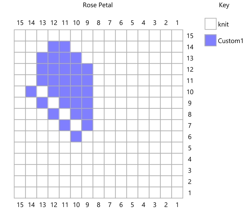 By drawing a petal that has one less row and one less column, I've reduced the size of the pattern. Expanded over the entire repeat, this will get me to the right number of rows and stitches.
At this point, it would be totally fine to draw out the rest of the pattern by hand. However, a little bit of copy/paste/rotate action saves a lot of work. This also helps to make sure that any inconsistencies get repeated (which is how patterns are made).
The next step is to fill in the outer petals. You'll notice that in the image on the left, the petals touch the outer edges. This isn't a problem if they touch a border that is the same color as the background. However, to make sure the pattern is clear, you can make the outer petals thinner, as in the image on the right. 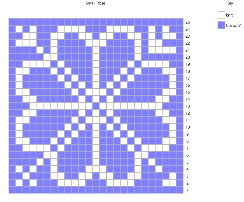 Now it's time to fill in the corner patterns. Because there are fewer stitches to work with than in the original, this pattern must also be adjusted. There are lots of options - I've placed a different pattern in each corner to show the possibilities. Normally you will choose one pattern and repeat it in each corner. At this point, the pattern is fully resized and you're free to use it in your pattern, or you can continue to play around with modifications. 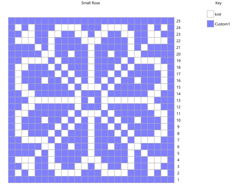 Here I've updated all the corner patterns with my favorite design, modified the center of the rose to be a little less busy, and added dots at the center of each petal. It's easy to play all day with modifying stitch patterns on graph paper or on the computer, but nothing beats a swatch! Because a knit stitch isn't exactly square, it's important to check your pattern in a swatch to make sure it will turn out the way you want it to. After that, the next step is to place your new design into the pattern you want to use, which will be the topic of the next post.  |
Archives
January 2024
Categories
All
|
 RSS Feed