|
Last fall, we moved across the country and into a new house. This was a huge shakeup! One of the things I needed was a new laundry basket to fit a dark and awkward corner in our bathroom. The Starting Point - A "Sad Greige" Laundry BasketI ended up buying this laundry basket at Target. The size was just right, but the gray fabric just made me sad. Right now gray walls are everywhere, but we decided to paint the house in more cheerful colors - peach, turquoise, and a very pale pink. So gray just wouldn't do. Luckily, I'm a weaver! I set out to weave a fabric that would go with our new color scheme, and brighten up that dark corner in the bathroom.
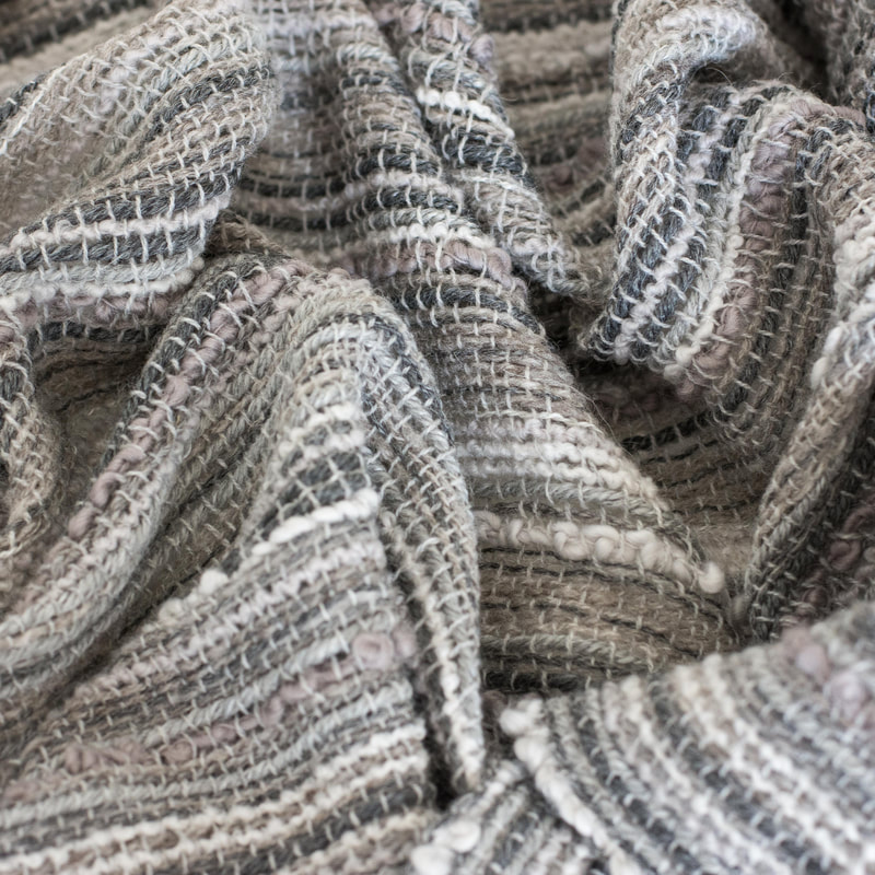
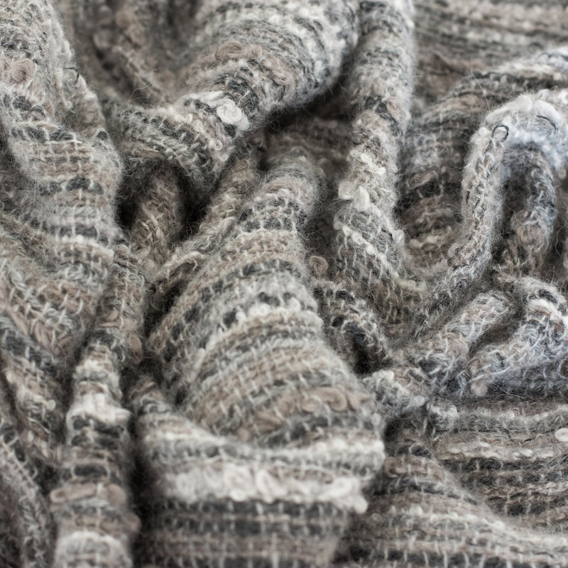
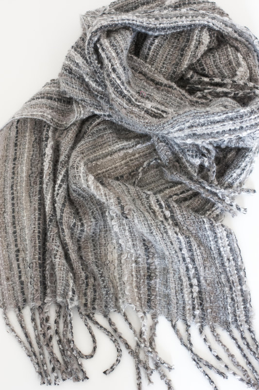 Yesterday, I cut the second of two warps off my SAORI loom. I had the idea for this fabric back in February - a highly textured warp woven loosely with a plain weft. I also wanted lots of shades of a similar color. I found a couple of different textured yarns that I liked - Woolfolk's Flette and Plymouth Yarn's Arequipa aventura. I had two skeins of each, and each skein was a slightly different shade of gray. I set them aside to marinate for a while, and discovered I had lots of unplied CVM singles from the first fleece I'd ever bought. I went ahead a plied them to make some of the softest yarn I've ever felt. Then I did another stash dive and found some laceweight gray alpaca yarns - some dark gray and some a pale silver. I started warping and designing in the reed for a fabric the width of my Saori WX60 loom (60 centimeters, or about 23.5 inches). It was still missing something, so I hopped on over to Spun and picked up two skeins of HiKoo's SimpliNatural in a dark gray and light silver color. Winding the warp for this fabric was no picnic. It wanted to tangle at every opportunity, and because many of the warp yarns were so thick, it wouldn't all fit on the warp beam - I had to cut off the last two yards and turn them into a separate warp. There were also lots of different kinds of yarn in this fabric - some very stretchy wool, some a little stretchy, and some not-stretchy-at-all alpaca. This was challenging both in the warping and the weaving - keeping an even tension on all these yarns was difficult, and led to a higher-than-average amount of loom waste.
Once I got the hang of it though, these pieces were quick and easy to weave. The weft is a wool/cashmere blend. Above on the left, you can see the fabric as it comes right off the loom, and on the right, after wet finishing. The fabric is insanely soft and has the most fabulous drape. 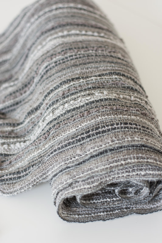 What will it become? I'd originally envisioned it as a throw blanket in three panels, but having to cut the warp in half may have thrown a wrench in that plan. So far, only the smaller piece has been wet-finished. Once I wet-finish the larger piece, I'll know more about how much fabric there is to work with.
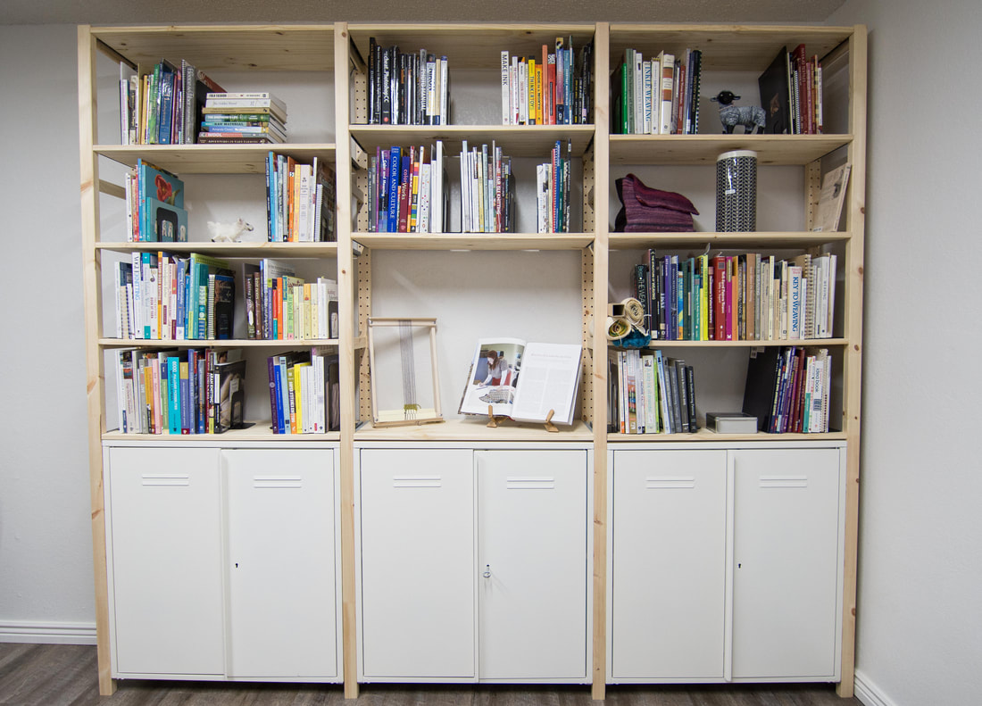 Recently, I reorganized my bookshelves, which included a total overhaul of how I organize my fiber arts books. Previously, there were a couple of knitting shelves, a spinning shelf, a weaving shelf, and a bunch of other books crammed in wherever they could fit. Then there were even more books all over my house...what can I say? I like books!
Organizing reference books has always been a bit of a challenge for me, especially when it comes to textile books. I want to be able to quickly locate garment design books, for example, or my stranded colorwork books. Some books clearly fall into one category, while others could fit into two or even three categories. With my recent reorganization, I used new and bigger bookshelves (these), so there was space to split books up into the following categories and sub-categories:
And those are just the books! In the cabinets at the bottom, I've stored some of the more unruly-looking things, like magazines, binders, and notebooks. So far I have been using this system for a couple of months, and it feels a lot easier to use. Not only are books easier to find, but they're more likely to get put away when I'm done with them. Plus, because there's a little bit more space than I need, it just feels more organized. And because the system is modular, it's possible to move, add, and adjust shelves over time. Do you have a ton of craft books? How do you organize them? Let me know in the comments! 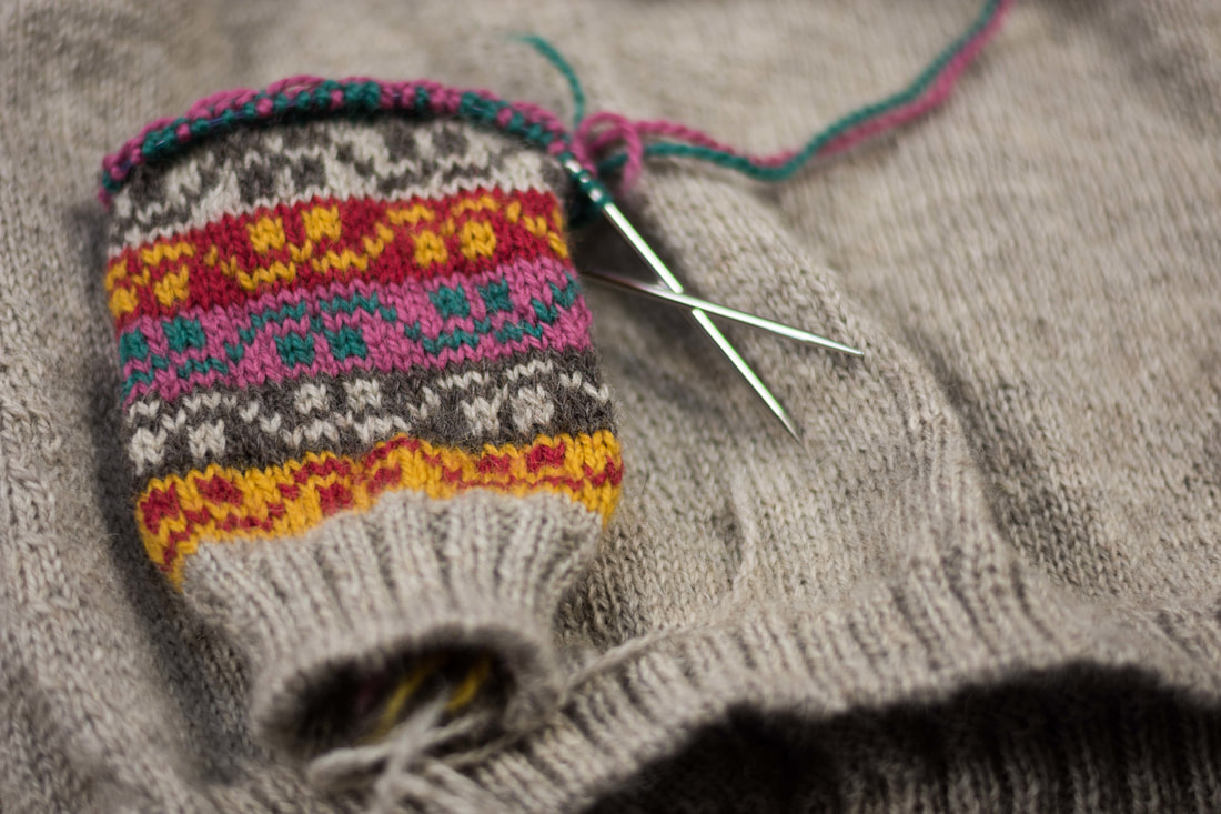 When Kate Davies first published the Miss Rachel's Yoke a couple of years ago, I knew I had to make it. I quickly bought the kit, intending to cast on right away.
Of course, life intervened, as it does, and by the time I was ready to knit there were a few roadblocks in my way:
But mostly, I was convinced I didn't have enough yarn. (Side note - I've decided always buy/spin more yarn/fiber than I think I need from here on out. I always end up picking the projects that require tons of yardage...) Earlier this month, we had a snowy day that had followed a very gray week. It was one of those weekends where I can't think of a reason to leave the house, and I was downright grumpy. My husband, in an attempt to cheer me up, suggested a trip to the movie theater. The only problem was, I didn't have anything to knit - at least, nothing I could knit in the dark. When I first learned to knit, I taught myself to knit without looking so that I could knit on the dark schoolbus, in dark cars riding home from dance lessons, and in the movie theater. Now, my "movie theater knitting" is always very basic. I can knit and purl in the same row if it's not a fancy pattern, but anything that might require a chart is out of the question. Usually I keep a sock on the needles for just such an occasion, but the socks I had going were too close to being done to entertain me for a whole two hours. I dove into the stash to see what my options were, and the Miss Rachel kit jumped out at me. I figured that even if I didn't have enough yarn, at least I'd have something to knit in the movie theater. And though I'd originally meant to make it a cardigan, I've realized that I wear pullovers a bit more often than I did when I first bought the kit, so a pullover it was. One benefit of waiting so long to cast on is that plenty of other Ravelers have had the chance to knit and write about this pattern, so I could let go of some of my anxiety about how it would turn out. Some standouts are: Uncrossed has incorporated a great short-row detail into the yoke. Ltnknitter, Agameda, and Lizoid have an interesting trick for hiding the jog. Crochet-Julie made the darker version, and managed to do her modeled shots in front of a photograph of the shawl that inspired the design. My project page is still in progress, but you can find it here. 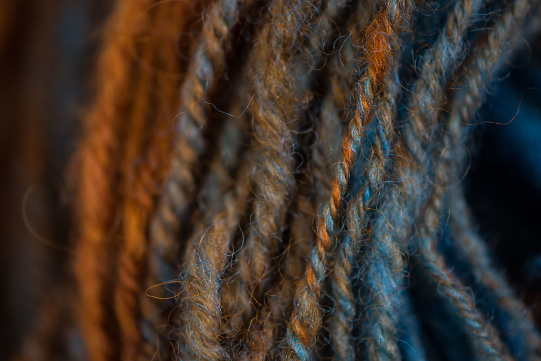 July means Tour de France. And while those batty bikers are spinning their wheels, silly spinners are spinning our wheels in Tour de Fleece - a loosely organized spinning challenge where the only ones we compete against are ourselves. We spin yarn while the bikers are riding, and rest while they rest. The idea is to challenge ourselves to something new, something big for us. This is the first year I've participated, and my challenge is play. To play with yarns textures, colors, and techniques I haven't tried before. To make lots of instant-gratification skeins (aka mini skeins) with no attachment to what they will become. A three-week workshop of fun, if you will. This week I spent some time playing in the mud. Not in the backyard, but on my spinning wheel. I was playing with making the color “mud” – on purpose. Lots of people will tell you that it’s a big no-no to mix complementary colors. They’ll tell you that mixing complementary colors will get you “mud,” and that you’ll be disappointed by it. But what “they” don’t tell you is that mud can be beautiful and fun. (Just ask any kid covered in real mud!) 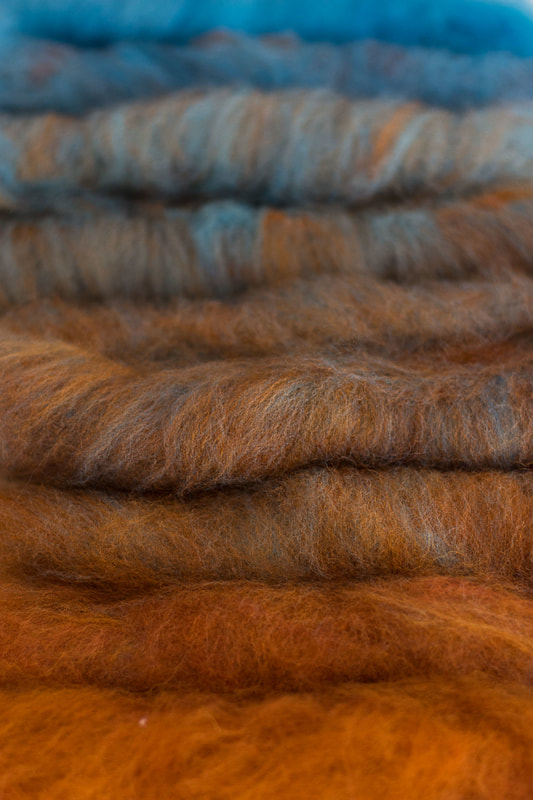 A crash course in color theory:
That's really all there is to it! The colors are often arranged in a color wheel, which is essentially the rainbow put into a circle: red, orange, yellow, blue, green, and purple. Colors opposite each other on the color wheel are considered complementary colors, or opposite from each other. These pairs are: red/green, blue/orange, and yellow/purple. The nifty thing about complementary colors is that each pair contains all three of the primary colors: one as pure primary color, and the other as a mix of the other two primary colors. For the complementary color pair of orange and blue, blue is the pure primary color, and orange is a mix of the primaries red and orange. The colors look satisfying together because they are opposites. They balance each other out. Think of college colors or sports teams – strong, opposite colors makes a strong and yet cohesive statement. The Denver Broncos, University of Virginia Cavaliers, and New England Patriots all use blue and orange as their team colors. I could go on, but I’d rather spend time playing with yarn than talking about sports. 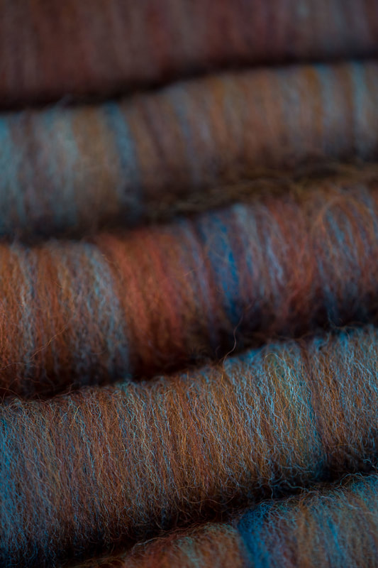 What happens when you mix complementary colors, like paint? As with all things, it depends. It depends on the intensity of the colors you mix, the proportions you mix them in, and how thoroughly you mix them. But the general consensus is that when you mix equal amounts and strengths of complementary colors, you’re likely to get “mud,” which is often brown, black, or a grayish color. Mud is the color that dashes the hopes of many an aspiring dyer or artist. They combine two colors that look great side-by-side and are disappointed the two didn’t combine to make something equally bright and exciting. Because all three primaries are represented in a mixture of complementary colors, they all tone each other down into a neutral. Sometimes this neutral is a dull, boring color. And sometimes it is rich, subtle, and intriguing. As someone who really loves neutral colors, this is a fun place to play. What happens when I add just a little bit of blue to orange? Or just a little bit of orange to blue? That’s what I was thinking when I decided to play in the mud this week. I wanted to show that mud isn’t something to fear. It’s something to understand, and use when it suits us. It’s something to help us achieve those subtle, complex colors that make people do a double take. What color is that? I love your colors! First, I started out with truly playing. I took a braid of blue that I dyed a while back. In truth, I really don’t love this color blue – it’s too flat, too plain, too cold. It’s not my color. For my orange, I took a braid of Lisa Souza’s BFL. My braid says the color is Deep Autumn, but it’s pretty darn close to her current color Aww-Tum. I randomly put the two onto my blending board as the spirit moved me, then made a handful of rolags and spun my heart out. I wound the singles into a center-pull ball and plied it into a two-ply from there. Here’s the result: 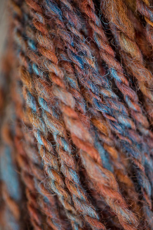 I had so much fun with that experiment, the next day I wanted to get a better handle on exactly what that color combination was that I loved so much. So this time, I had a little more of a controlled playtime. I wanted smallish samples, so I set my scale to grams. I made a gradient where each sample was 3-4 grams total. I started with 100% orange, then 90% orange/10% blue (this is my best guess, as that small of an amount didn’t register with my scale), 75% orange/25% blue, 67% orange/33% blue, 50% orange/50% blue, 33% orange/67% blue, 25% orange/75% blue, 10% orange/90% blue, and 100% blue. Maybe I got a little bit carried away! 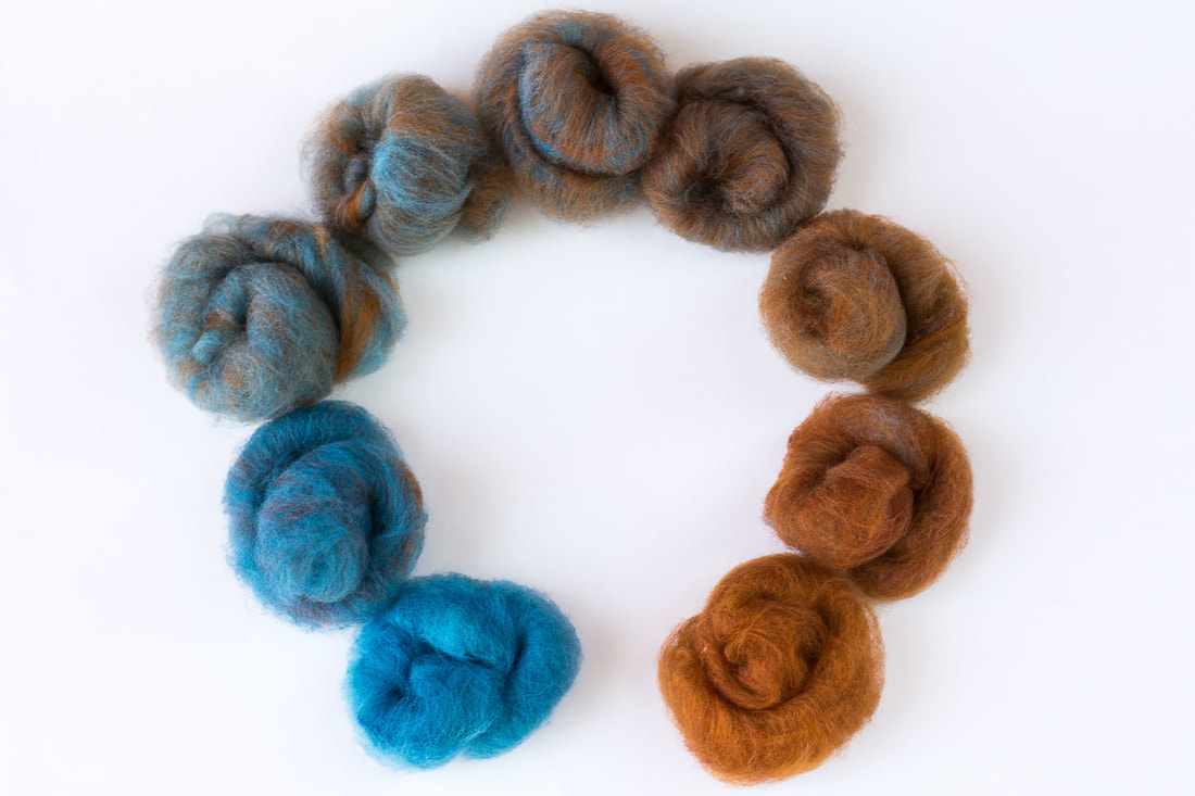 Then I set about carding the colors together so they were well blended. Each color blend got its own rolag, and I found that 4 grams of fiber is about the max my handcards can comfortably hold. After carding, it was time to spin. As Norman Kennedy says, “Good carding – your yarn’s half spun.” But my wheel was acting up – she’s a grouchy old lady who complains when her joints are out of whack. My fiber prep felt great and easy to spin, but treadling my wheel felt like walking through sand. (Or mud! 😊) It took me just about all of my spinning session to get the wheel adjusted just right to where I was actually moving. I spun the gradient in order, then chain plied to keep the color progression from orange to blue. I found that my favorite colors in this gradient are on the orange side, though the 75% blue/25% orange mixture reminds me of a lovely oxidized copper. 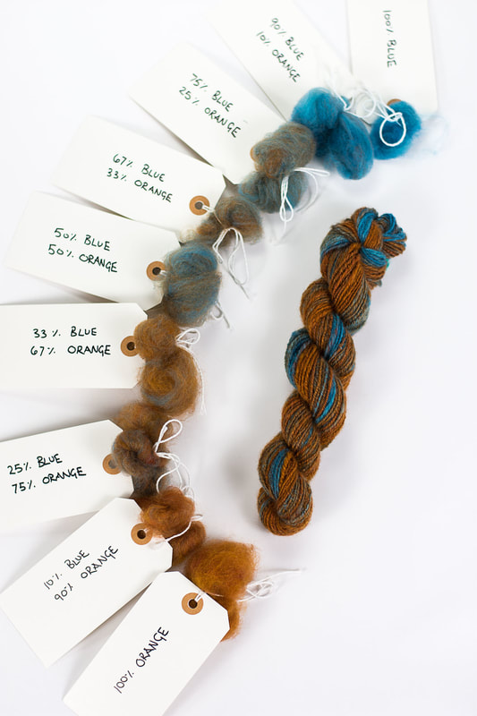 Using the technique of mixing mud on purpose can be really useful in colorwork of all kinds – you can create deep and intriguing colors that blend and speak with each other. And I'm not just talking about stranded colorwork in knitting - there are interesting places for this technique in anything that uses fiber and color, including weaving, crochet, rug hooking, rug punching, embroidery, you name it! If you’re using an orange and want a brown, why not make it yourself by blending your orange with a navy blue? You’ll get something that is much more related to your orange because it already contains your orange. You can create a whole range of complex and deep colors from just a basic few. (Though I'll never tell you that you shouldn't add a fun new color to your stash!) Making mud on purpose isn’t just fun – it gives you a huge range of complex colors to play with. All you need is a tiny understanding of color theory and practice, practice, practice! xx,
Pamela |
Archives
January 2024
Categories
All
|
 RSS Feed