Fast Fashion Gets Faster. But It Has An Incredible Opportunity to Make a Change for the Better7/20/2018
Prototypes in the fashion industry used to be considered essential. But with the rise of 3-D rendering of clothing designs, they're quickly becoming obsolete.
That's the focus of this article, which I read with great interest earlier this week. My immediate response was "Great. Another way for fast fashion to get even faster. And cheaper, and lower quality. Another way to destroy the planet, faster." And it's quite likely that a lot of fashion brands will use the technology exactly in this way. My second thought was that there's a lot of opportunity here - less cost and less waste being chief among them. Fashion brands can (and are beginning to) market using 3-D renderings that are so good, it's hard to tell they only exist on the screen. They can then decide whether there's enough consumer demand to go forward with a design, rather than spending the time, money, and resources on producing garments that just sit on shelves. Given the fashion industry's current trajectory, it seems like the cost and waste reduction benefits of this technology will be overshadowed by the moremoremore mentality. Fashion brands eager to revive dwindling profits will use everything in their power to get back on top. But a few brands will hopefully grasp that more and better aren't the same thing. That they can gain more profit by streamlining their processes to produce(and waste) less, while selling substantially all of their stock every season. Tour de Fleece is in full swing. I posted yesterday about one of my personal projects, but you should totally check out the Facebook and Ravelry groups too!
This post has been making the rounds on Facebook lately. It totally speaks to me. I'd love a chance to see this exhibit. July means Tour de France. And while those batty bikers are spinning their wheels, silly spinners are spinning our wheels in Tour de Fleece - a loosely organized spinning challenge where the only ones we compete against are ourselves. We spin yarn while the bikers are riding, and rest while they rest. The idea is to challenge ourselves to something new, something big for us. This is the first year I've participated, and my challenge is play. To play with yarns textures, colors, and techniques I haven't tried before. To make lots of instant-gratification skeins (aka mini skeins) with no attachment to what they will become. A three-week workshop of fun, if you will. This week I spent some time playing in the mud. Not in the backyard, but on my spinning wheel. I was playing with making the color “mud” – on purpose. Lots of people will tell you that it’s a big no-no to mix complementary colors. They’ll tell you that mixing complementary colors will get you “mud,” and that you’ll be disappointed by it. But what “they” don’t tell you is that mud can be beautiful and fun. (Just ask any kid covered in real mud!) A crash course in color theory:
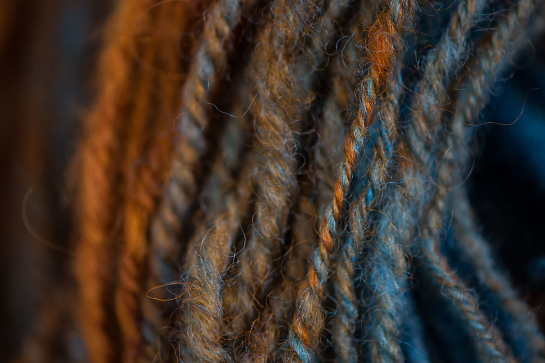
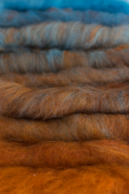
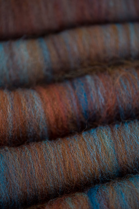
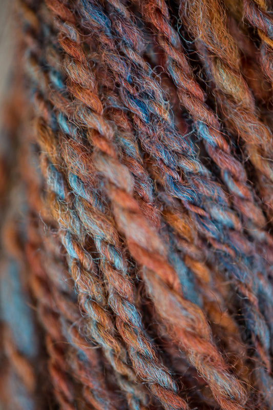
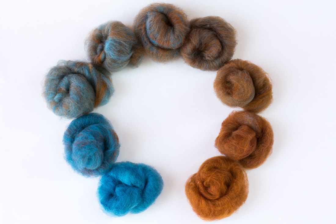
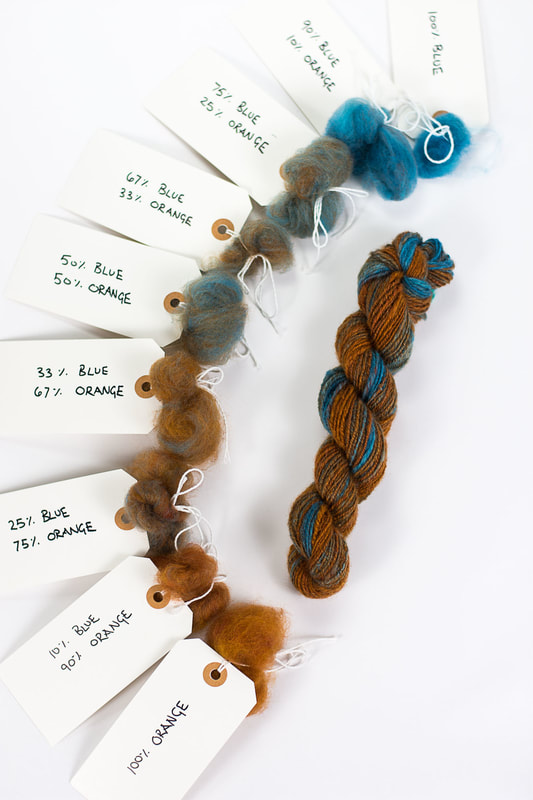
That's really all there is to it! The colors are often arranged in a color wheel, which is essentially the rainbow put into a circle: red, orange, yellow, blue, green, and purple. Colors opposite each other on the color wheel are considered complementary colors, or opposite from each other. These pairs are: red/green, blue/orange, and yellow/purple. The nifty thing about complementary colors is that each pair contains all three of the primary colors: one as pure primary color, and the other as a mix of the other two primary colors. For the complementary color pair of orange and blue, blue is the pure primary color, and orange is a mix of the primaries red and orange. The colors look satisfying together because they are opposites. They balance each other out. Think of college colors or sports teams – strong, opposite colors makes a strong and yet cohesive statement. The Denver Broncos, University of Virginia Cavaliers, and New England Patriots all use blue and orange as their team colors. I could go on, but I’d rather spend time playing with yarn than talking about sports. What happens when you mix complementary colors, like paint? As with all things, it depends. It depends on the intensity of the colors you mix, the proportions you mix them in, and how thoroughly you mix them. But the general consensus is that when you mix equal amounts and strengths of complementary colors, you’re likely to get “mud,” which is often brown, black, or a grayish color. Mud is the color that dashes the hopes of many an aspiring dyer or artist. They combine two colors that look great side-by-side and are disappointed the two didn’t combine to make something equally bright and exciting. Because all three primaries are represented in a mixture of complementary colors, they all tone each other down into a neutral. Sometimes this neutral is a dull, boring color. And sometimes it is rich, subtle, and intriguing. As someone who really loves neutral colors, this is a fun place to play. What happens when I add just a little bit of blue to orange? Or just a little bit of orange to blue? That’s what I was thinking when I decided to play in the mud this week. I wanted to show that mud isn’t something to fear. It’s something to understand, and use when it suits us. It’s something to help us achieve those subtle, complex colors that make people do a double take. What color is that? I love your colors! First, I started out with truly playing. I took a braid of blue that I dyed a while back. In truth, I really don’t love this color blue – it’s too flat, too plain, too cold. It’s not my color. For my orange, I took a braid of Lisa Souza’s BFL. My braid says the color is Deep Autumn, but it’s pretty darn close to her current color Aww-Tum. I randomly put the two onto my blending board as the spirit moved me, then made a handful of rolags and spun my heart out. I wound the singles into a center-pull ball and plied it into a two-ply from there. Here’s the result: I had so much fun with that experiment, the next day I wanted to get a better handle on exactly what that color combination was that I loved so much. So this time, I had a little more of a controlled playtime. I wanted smallish samples, so I set my scale to grams. I made a gradient where each sample was 3-4 grams total. I started with 100% orange, then 90% orange/10% blue (this is my best guess, as that small of an amount didn’t register with my scale), 75% orange/25% blue, 67% orange/33% blue, 50% orange/50% blue, 33% orange/67% blue, 25% orange/75% blue, 10% orange/90% blue, and 100% blue. Maybe I got a little bit carried away! Then I set about carding the colors together so they were well blended. Each color blend got its own rolag, and I found that 4 grams of fiber is about the max my handcards can comfortably hold. After carding, it was time to spin. As Norman Kennedy says, “Good carding – your yarn’s half spun.” But my wheel was acting up – she’s a grouchy old lady who complains when her joints are out of whack. My fiber prep felt great and easy to spin, but treadling my wheel felt like walking through sand. (Or mud! 😊) It took me just about all of my spinning session to get the wheel adjusted just right to where I was actually moving. I spun the gradient in order, then chain plied to keep the color progression from orange to blue. I found that my favorite colors in this gradient are on the orange side, though the 75% blue/25% orange mixture reminds me of a lovely oxidized copper. Using the technique of mixing mud on purpose can be really useful in colorwork of all kinds – you can create deep and intriguing colors that blend and speak with each other. And I'm not just talking about stranded colorwork in knitting - there are interesting places for this technique in anything that uses fiber and color, including weaving, crochet, rug hooking, rug punching, embroidery, you name it! If you’re using an orange and want a brown, why not make it yourself by blending your orange with a navy blue? You’ll get something that is much more related to your orange because it already contains your orange. You can create a whole range of complex and deep colors from just a basic few. (Though I'll never tell you that you shouldn't add a fun new color to your stash!) Making mud on purpose isn’t just fun – it gives you a huge range of complex colors to play with. All you need is a tiny understanding of color theory and practice, practice, practice! xx,
Pamela Just because I haven't shared links in a while doesn't mean I haven't been collecting them...
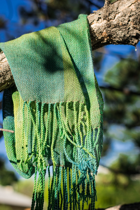
News flash: knitting stretches! But how it stretches is actually pretty fascinating. Dior? Or Bihor? This story about how Romanian weavers are successfully standing up to cultural appropriation from Dior is pretty awesome. This post on a "garbage" fleece was eye-opening for me. We're addicted to easy. It's about so much more than rugs. And lastly, a fun video showing "waulking," a traditional method of wet-finishing woolen fabric. It's been a scorcher around here, so naturally the solution is more yarn. (And AC/fans, and doing all my outdoor activites before the sun comes up.) Still, there hasn't been much knitting happening. Why have a lap full of wool when you can weave or spin instead? I've managed to do a fair bit of weaving - I got the floor loom pieces done and managed to get a couple of things on and off the rigid heddle loom, and warped and wove a handpainted warp from a workshop I took in May. Most of these things seem to exist only over on Instagram, so feel free to check me out over there! I did escape to Montana for a glorious week of perfect weather, and had lots of fiber fun to boot. At MAWS, I fell pretty hard for SAORI weaving, and have been looking for ways to incorporate its principles into more of my weaving. Knitting
Weaving
Spinning
Sewing
Happy Fourth of July to all y'all in the States! xx,
Pamela |
Archives
January 2024
Categories
All
This website uses marketing and tracking technologies. Opting out of this will opt you out of all cookies, except for those needed to run the website. Note that some products may not work as well without tracking cookies. Opt Out of Cookies |
 RSS Feed